Designing interpretability for a ML optimization system
Shipped in
2024
My role
Product design, Co-author of published paper
Team
Myself + 2 ML scientists + Data Engineer + CTO + Product Owner
Contextual bandits are powerful and nearly impossible to read. The people responsible for them are operators and marketers, not statisticians, and there was no established visual language for what the algorithm was actually doing. Together with Metica's data science and engineering team, I designed an interface that closes that gap, co-authored into a peer-reviewed paper at IntRS'24.
The impact
First openly published interpretability interface for contextual bandits, peer-reviewed at IntRS'24
Demo centrepiece for customer-facing presentations; cited as a market differentiator by the sales team
No comparable interface has been published openly to date
The problem with bandits
A/B testing has a mature visual language. Uplift charts, confidence intervals, a single winner declared after enough data. Contextual bandits don't work that way. The bandit isn't picking one variant for everyone; it's picking the best arm per context, continuously, while balancing exploration and exploitation. That makes "is it working?" a genuinely hard question to answer in a single glance.
The people who needed to answer it were operators and marketing teams, not data scientists. They understood outcomes, they understood campaigns, but they weren't familiar with off-policy evaluation or arm ablation. The interface had to work for them, not for us.
A metric that runs through everything
The first decision was about what to actually measure. We introduced a metric called value gain, derived from off-policy evaluation, which estimates how much additional value the bandit produces compared to a counterfactual where a given component, an arm or a context field, is removed. One metric, but it powers everything: the top-level uplift, the per-variant expected benefit, and the radial position of every dot in the radar chart.
Having a single coherent number let us build a layered interface where every view is answering the same question at a different level of detail. Operators could start with the summary, dig into variant-level performance, then zoom into individual contexts, all without switching mental models.
Why we chose a radar chart
Showing performance per context was the hardest part. Each context is a vector, a combination of player attributes, and the bandit is picking arms differently for each one. A bar chart collapses that into averages. A table buries it in rows. Neither shows the shape of what's happening.
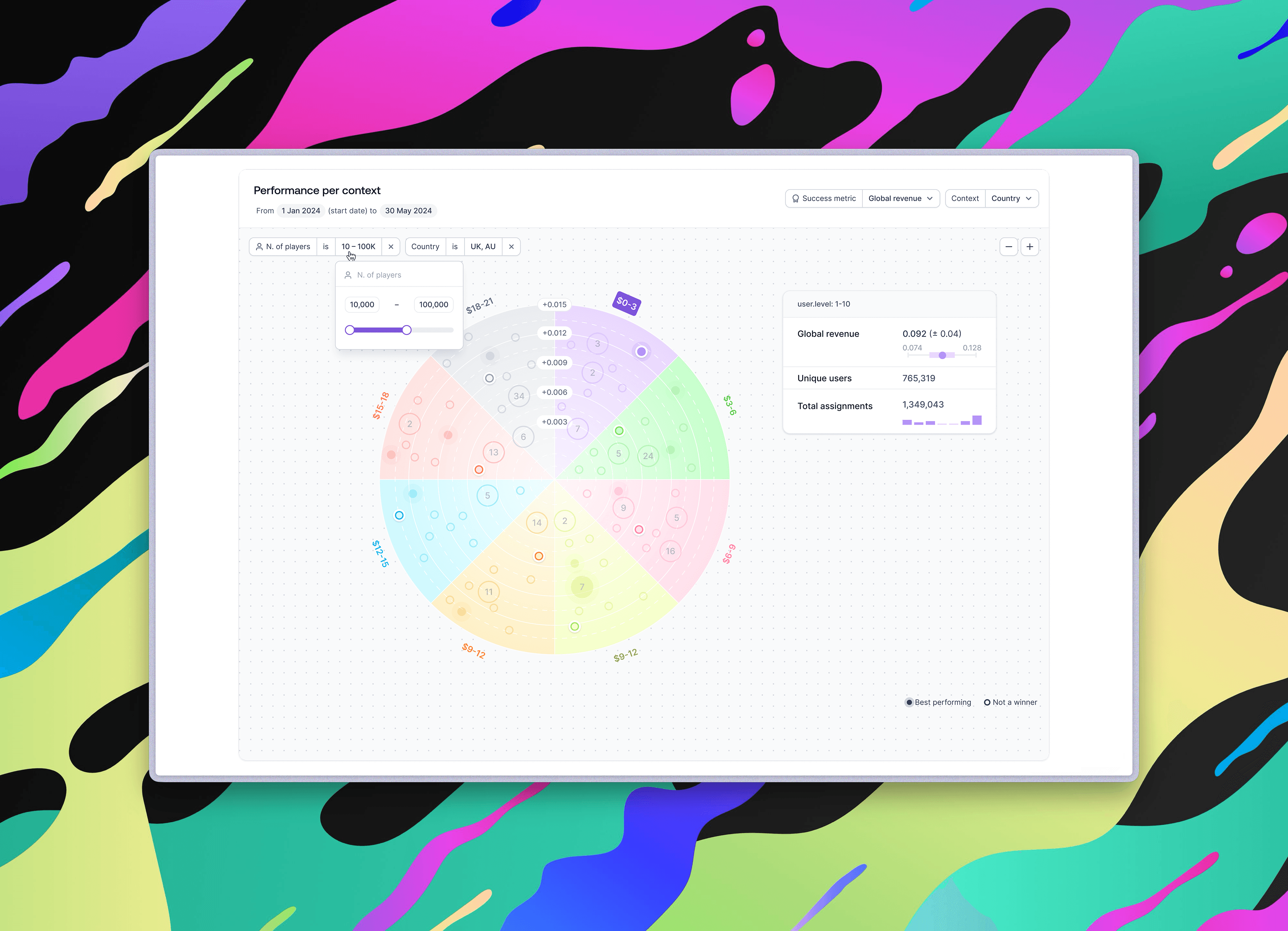
We landed on a circular chart divided into segments, one per arm. Each dot represents a context vector the bandit encountered; its distance from the centre is the value gain that arm delivered for that context. At a glance, you can see which arms win for which contexts, and by how much. In our user study, participants described it as daunting at first, then quickly readable once the simpler summary views had primed them. That was expected. We designed for it by sequencing information: simple summaries first, radar last.
Five principles we wrote down and kept
The paper formalised five design principles that came out of the work. They shaped every decision, and they've held up as the product evolved. Trust the audience with technical tools if those tools are the right fit. Use the language operators actually use, not the language statisticians use ("expected benefit" failed in testing; "uplift vs original" worked). Order information consciously, from simple to complex. Contextualise results with volume and significance so operators aren't left staring at a number with no frame of reference. And close the loop to a decision, because insight that doesn't lead somewhere isn't useful.
What changed after it shipped
The paper captured the chart as it existed in 2024. Customer feedback since drove four meaningful updates. In high-traffic bandits, the dots clustered tightly near the centre, so we rebuilt the radar on an infinite zoomable canvas, letting operators zoom into any region and click individual dots to inspect them. We added two filters, number of players and country, a direct response to a request from one of our original study participants. Clicking a dot now opens a detail popover with supporting metrics: global revenue with confidence interval, unique users, total assignments. And a persistent legend distinguishes best-performing arms from non-winners per context, filled versus outlined dots.
Each of those changes maps back to the same two principles: contextualise results, facilitate decisions. The framework did its job.
Prototype showing changes and interaction updates after users' feedback (5th iteration)
What peer review meant for the work
Getting to co-author a paper, and to see the principles hold up as the product evolved, strengthened the relationship between design and data-based research. The work was stronger for being written down precisely enough to publish. And it's a clean example of what design and data science collaboration looks like when the handoff wall doesn't exist.
To this day, no comparable bandit interface has been published openly.